By the end of this session, you should be able to:
Explain the difference between euclidean and correlation distances and interpret a distance matrix
Explain why row scaling can be misleading in clustering
Step through the basic steps of hierarchical clustering and interpret clustering trees
Run clustering methods to produce clusters in your data with the {pheatmap} package
Visualize clusters to assess validity
7.2 What is Clustering?
Clustering is a method for finding groupings in data.
The data must be at least ordinal (categorical or continuous, but with some implied order) and in matrix format. The data does not all have to be the same type (you can mix continuous and categorical)
In the case of expression data, the counts are in matrix form, which means we can utilize them for clustering.
Our data is in matrix form, which is what pheatmap expects.
Matrices are different than data.frames
The matrix structure looks like a data.frame, but actually has more in common with a vector. Specifically:
All columns must have the same type (numeric, logical, factor)
A matrix has row names as well as column names
The matrix format can be derived using the assay() method, or data.frames that all have the same column type can be converted to matrix using as.matrix().
7.3pheatmap package
We will use the pheatmap package as it is highly customizable in terms of the presentation.
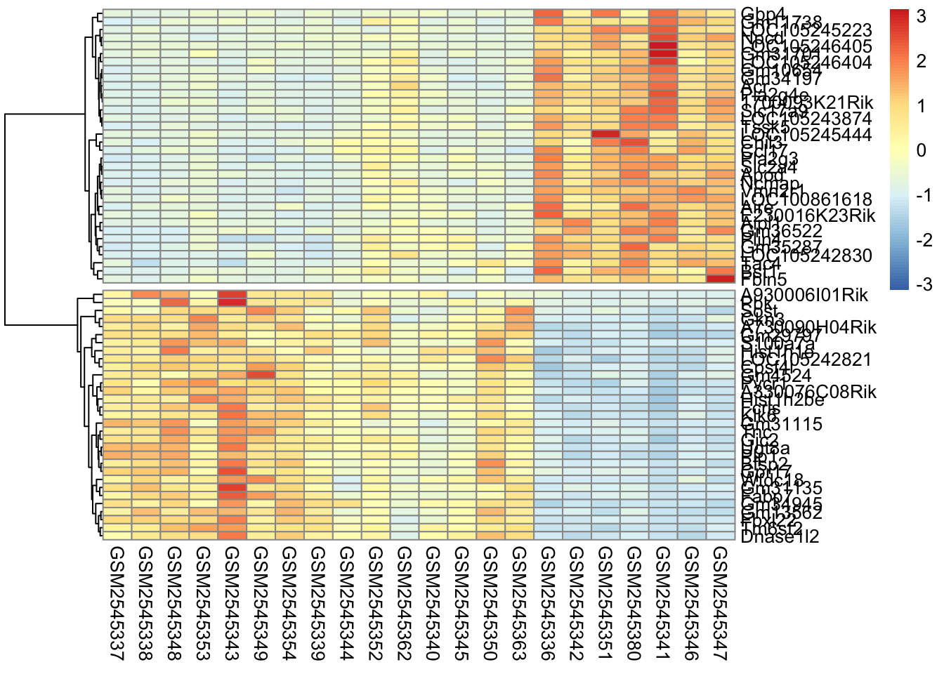
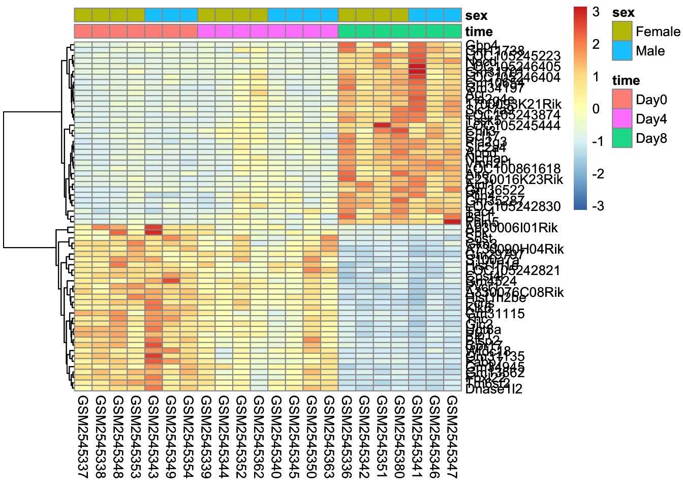
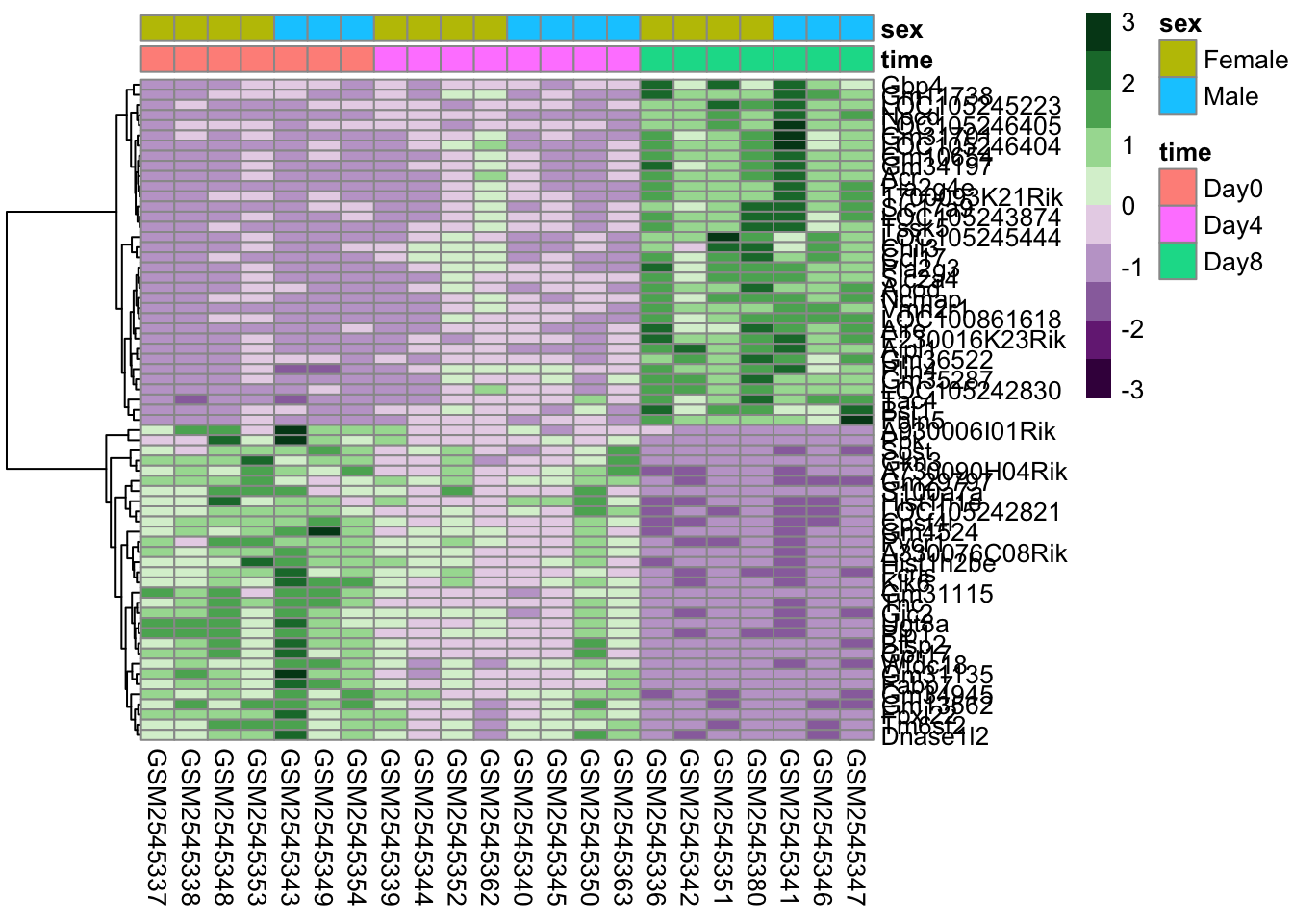
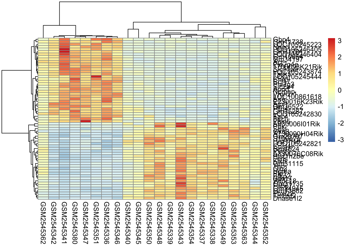
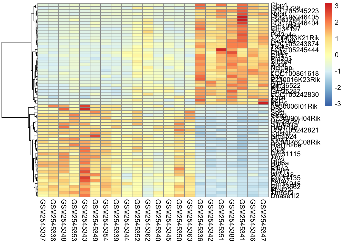
Here’s what is considered a fairly standard heatmap of our geneset.
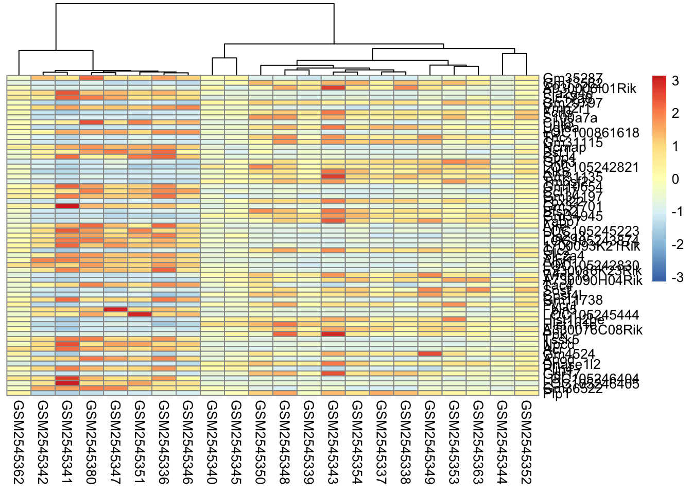
The first option we have is to cluster by rows, columns, or both.
Clustering is largely about ordering the data. For row based clusterin, we order the rows based on how similar the rows are to each other (we’ll cover this in the distance section).
For row-based clustering, we need to specify both the cluster_rows argument and the clustering_distance_rows argument.
Column based clustering sorts the columns based on how similar they are to each other. Without the sample annotation for columns, it is hard to see how the columns are related to each other.
Which one should you use? It depends on the application:
Row clustering is helpful for seeing expression relationships in the data
Column clustering is helpful for seeing sample relationships in the data
Both gives you both.
In our case, since the samples are related by time, it makes the most sense for us to only do the row-based clustering.
Garbage In, Garbage Out
Clustering algorithms will always give you an answer. Whether the grouping makes sense or not depends on the quality of data you are including. Cleaning and filtering your data prior to putting it in a clustering algorithm is critical.
Missing data can also affect the output of a clustering, so it is critical to assess whether how much of your data is missing. Some methods have explicit ways to deal with missing values (such as imputation) and it’s important to understand what the methods are doing.
It’s also important to assess what is signal and what is noise. Clustering algorithms are highly sensitive to noise.
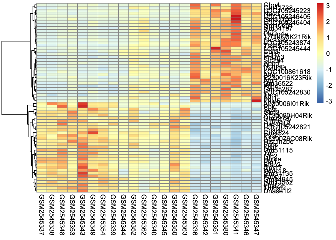
7.5 Scaling
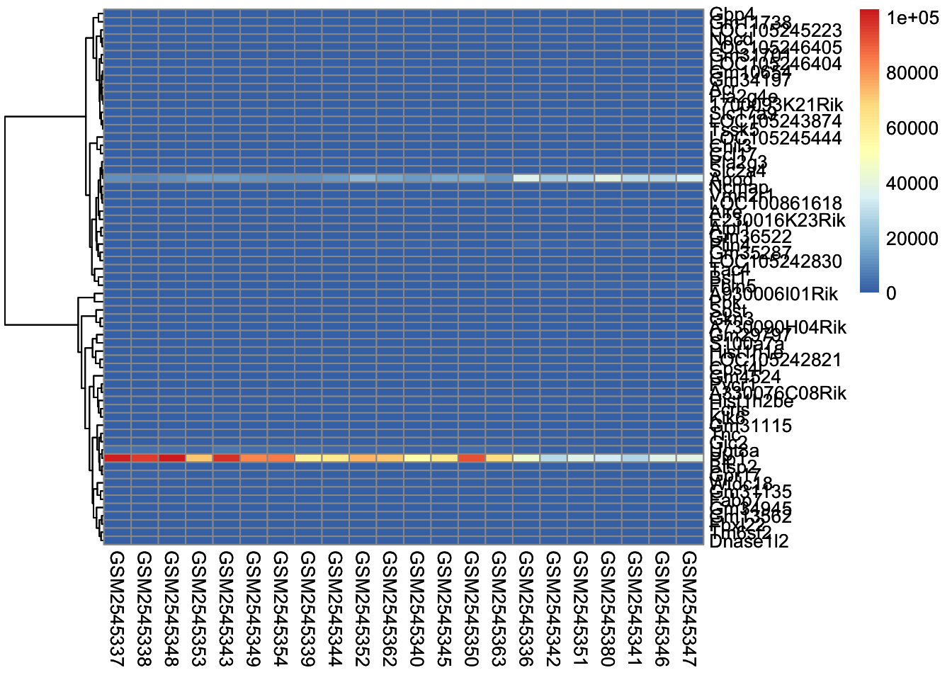
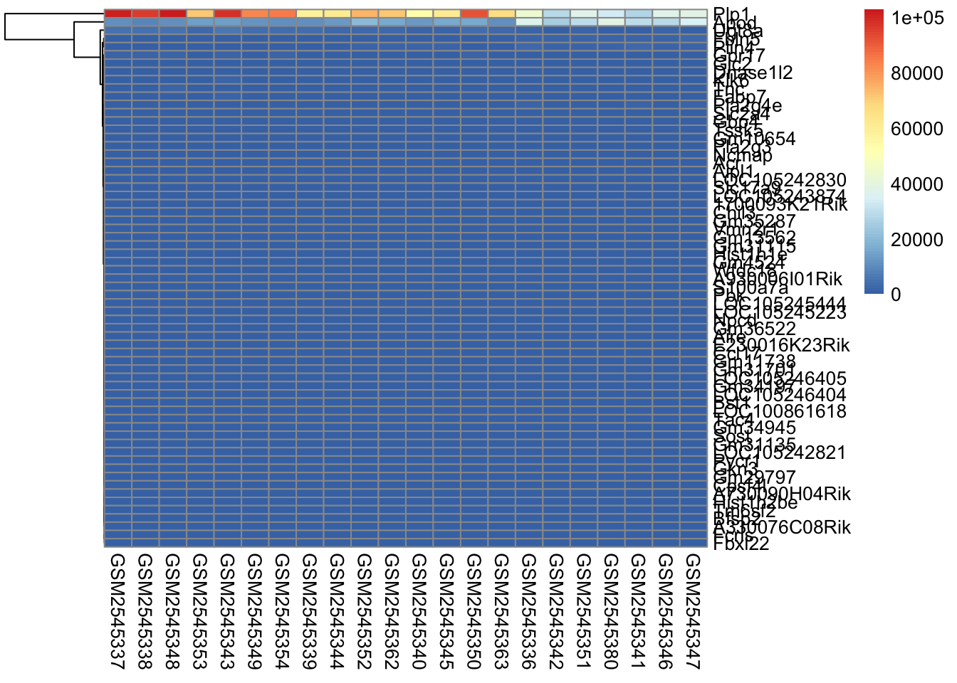
The next parameter we’ll investigate is the scale parameter. Try running the below code, which does no scaling and compare it with the heatmap above. What do you notice?
scaled_heatmap<-pheatmap(gse_data, cluster_rows =TRUE, cluster_cols =FALSE, # set to FALSE if you want to remove the dendograms# clustering_distance_cols = 'euclidean', clustering_distance_rows ='correlation', scale="none")scaled_heatmap
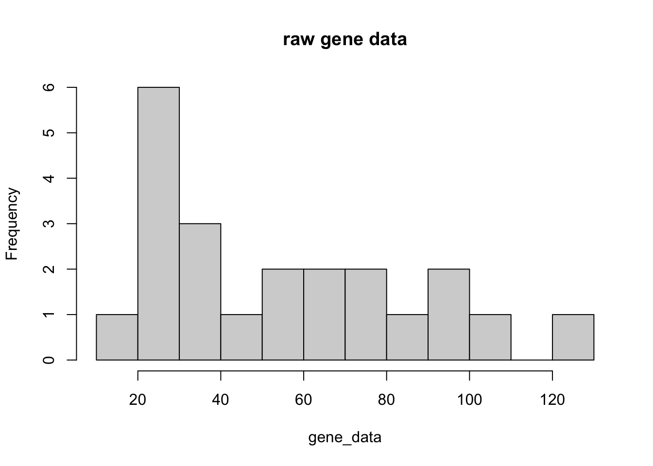
Without scaling, we are plotting the normalized counts in our heatmap. There are two genes with very high expression, Apod, and Plp1, that dominate our heatmap.
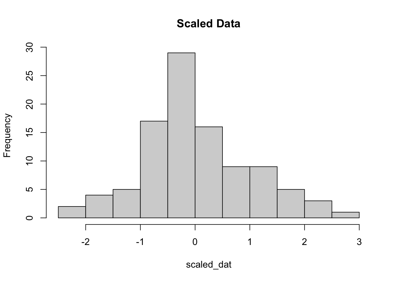
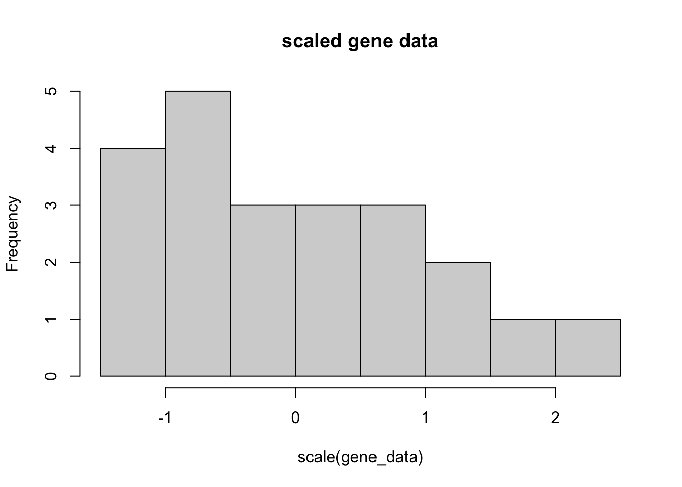
So why do we scale? The short answer is that we want to get the expression of each gene to be roughly on the same scale. We do this by calculating the [z-score] for each row of the data.
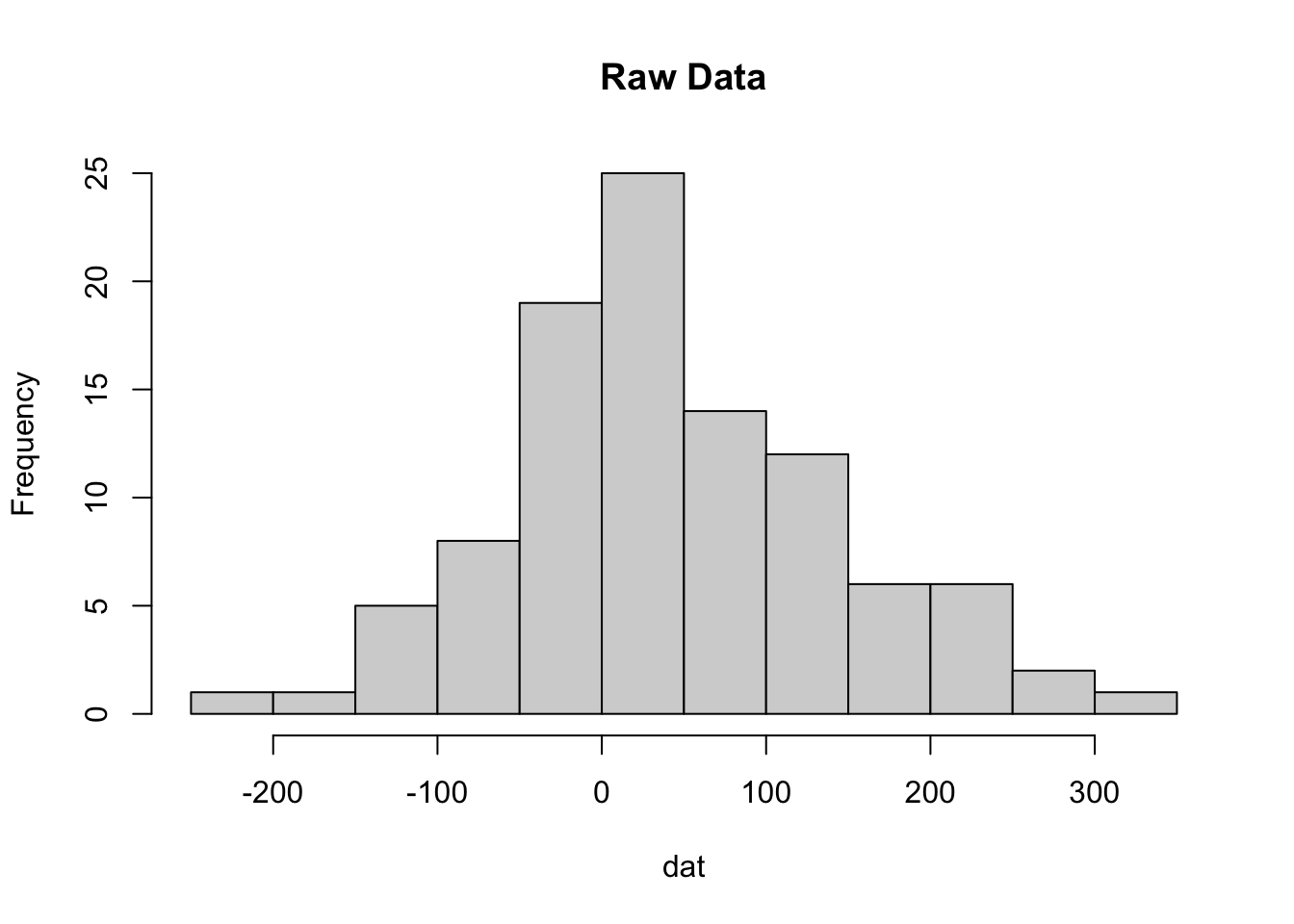
By definition, z-scores have a mean of zero and usually range between 3 and -3 standard deviations. Here is an example using data drawn from a normal distribution. We randomly sample 100 values from the normal distribution with mean 30, and a standard deviation of 100.
The scaling parameter will scale the data within each row, or gene. Here is an example of the matrix output of the scaled data. In general, scale() works on rows, so we have to transpose our matrix using t() so that the columns become rows, and rows become columns, scale it, then transpose it back.
Why is this important? We actually are removing information when we’re plotting the heatmap. We are basically trying to make the data have the same mean (0) and the same range (from -3 to 3).
This is also why removing noisy genes is important for our analysis.
7.6 Distance Metric
At the heart of heatmaps is something called the distance, or dissimilarity matrix. For row based clustering, we compare two gene rows and calculate how dissimilar they are.
We’ll talk about two distance metrics: Euclidean and Correlation (Non parametric distance metrics are also potentially interesting, including rank-based (spearman’s) correlation).
Correlation-based distance basically compares the shape of two profiles, but ignores magnitude. It ranges from -1 (anticorrelated) to 1 (correlated)
Euclidean distance ignores shape, but considers magnitude. It ranges from 0 (identical) to infinity.
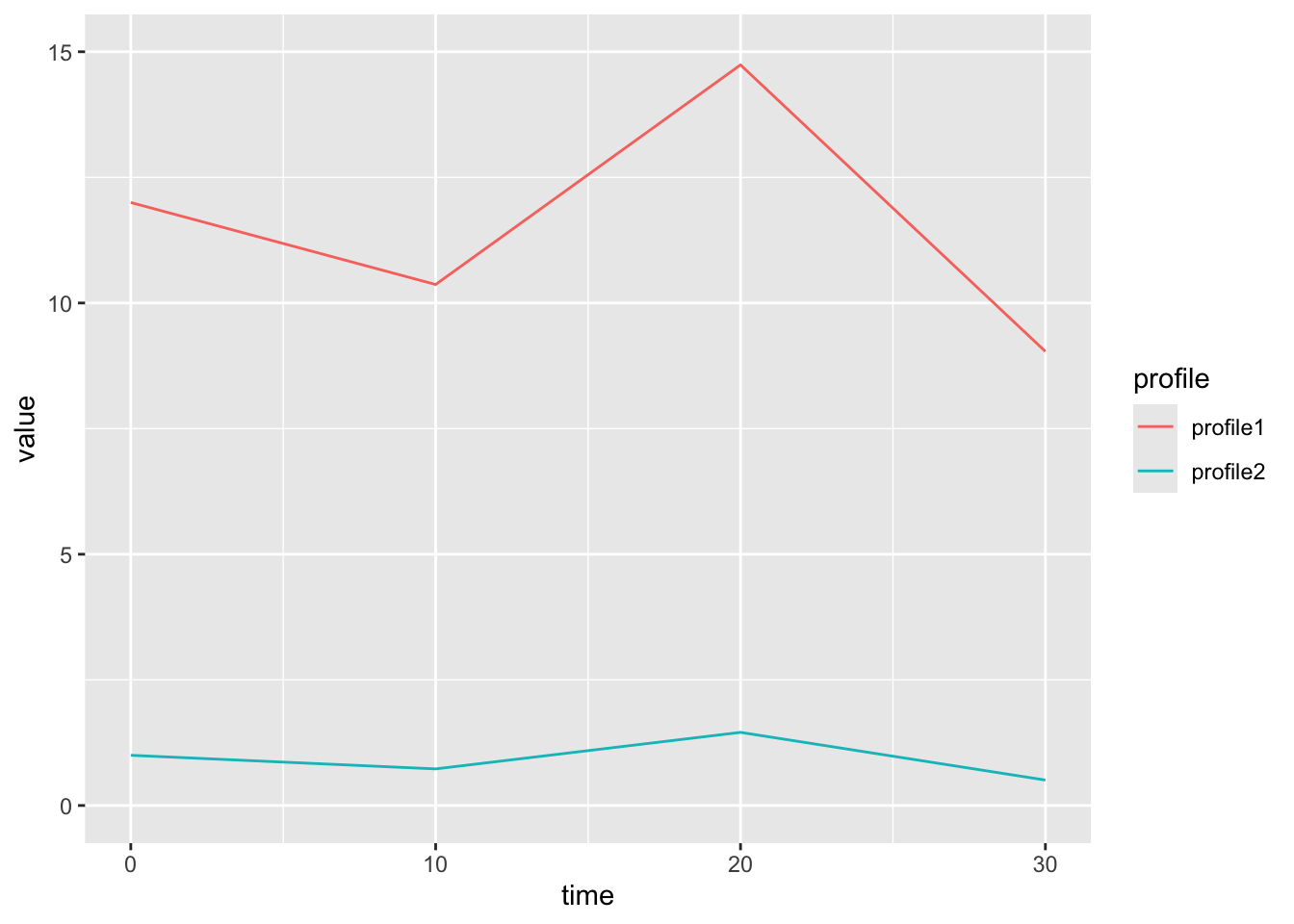
Here is an example of two genes that are similar in shape, but not magnitude. This will have a low correlation dissimilarity.
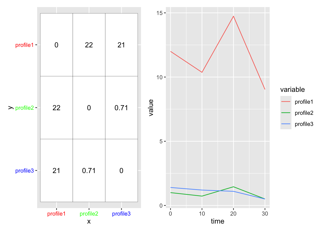
We use the distance metric to calculate a distance matrix, which gives a sense for how ‘close’ two profiles are in your data. The [ith,jth] entry in the distance matrix gives the distance between profile i and profile j in your data. (Note the distance matrix is symmetric about the diagonal, so [i,j] == [j,i], and that [i,i] == 0).
Warning: Vectorized input to `element_text()` is not officially supported.
ℹ Results may be unexpected or may change in future versions of ggplot2.
Vectorized input to `element_text()` is not officially supported.
ℹ Results may be unexpected or may change in future versions of ggplot2.
Warning: Vectorized input to `element_text()` is not officially supported.
ℹ Results may be unexpected or may change in future versions of ggplot2.
Vectorized input to `element_text()` is not officially supported.
ℹ Results may be unexpected or may change in future versions of ggplot2.
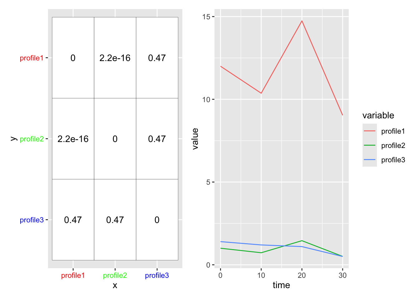
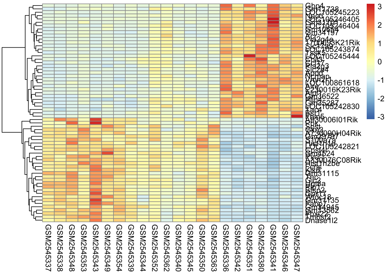
In this case, our two clusterings look fairly similar if we use row scaling. But this is not always the case.
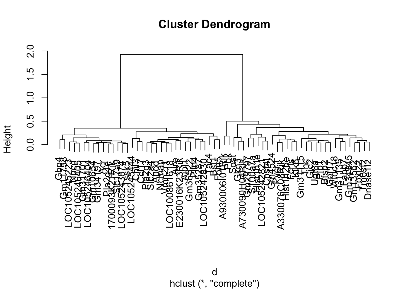
7.8 Intro to Hierarchical Clustering
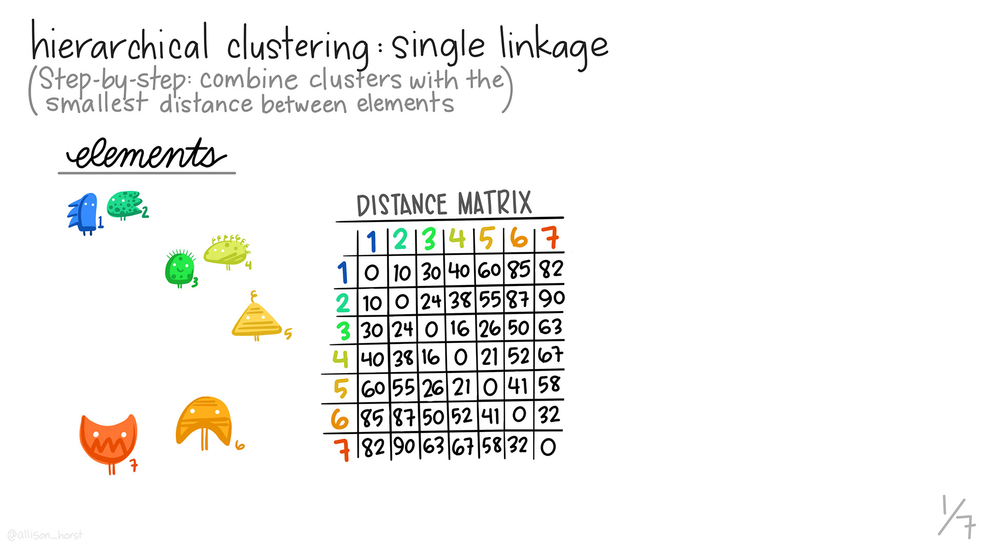
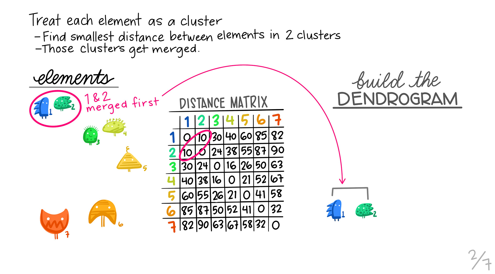
In hierarchical clustering, we are grouping similar profiles together into clusters. The type of clustering we’ll look at is called agglomerative, or bottom up clustering. Agglomerative clustering starts out at the individual level and slowly builds up. All slides are from Allison Horst.
We start with the distance matrix for our data.
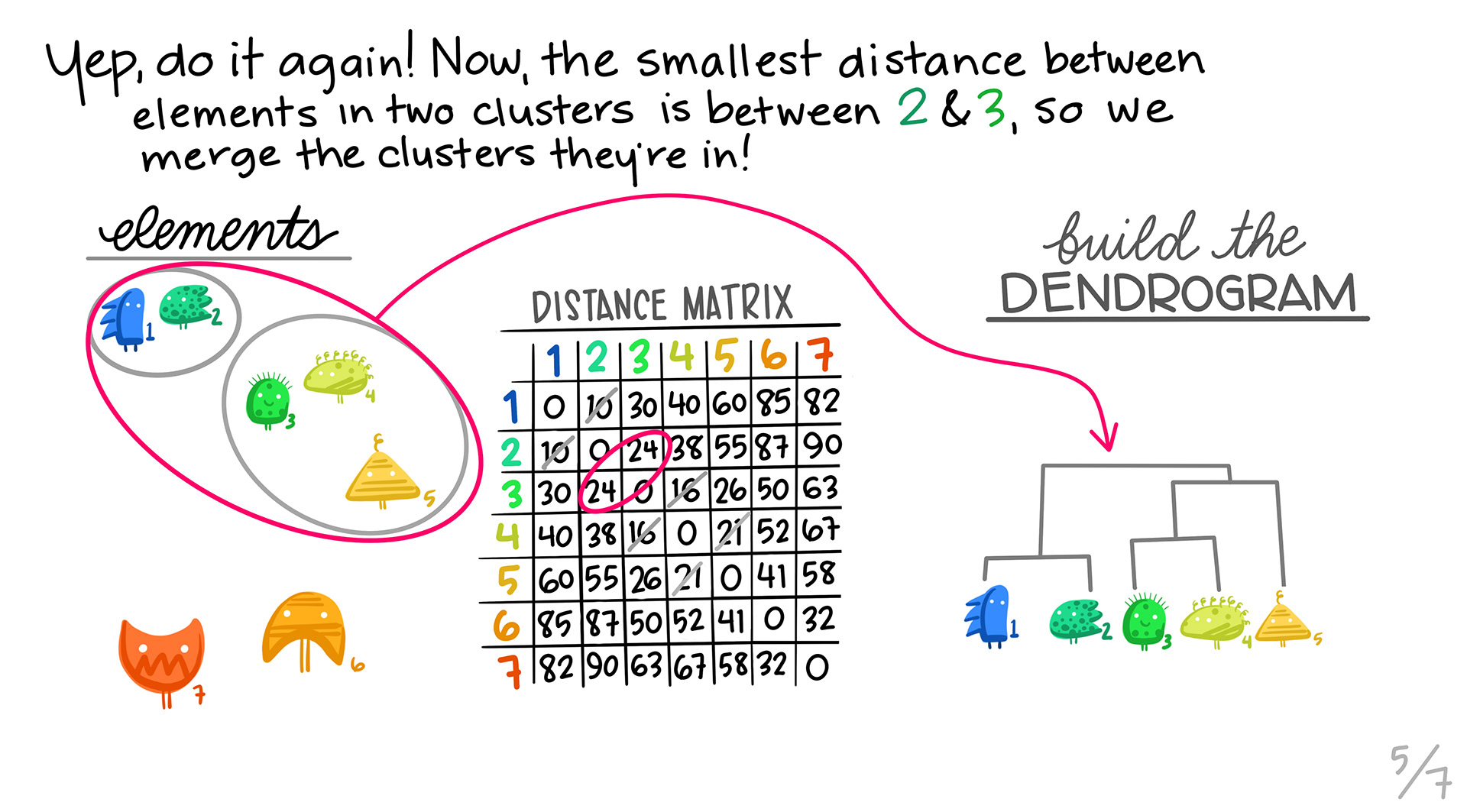
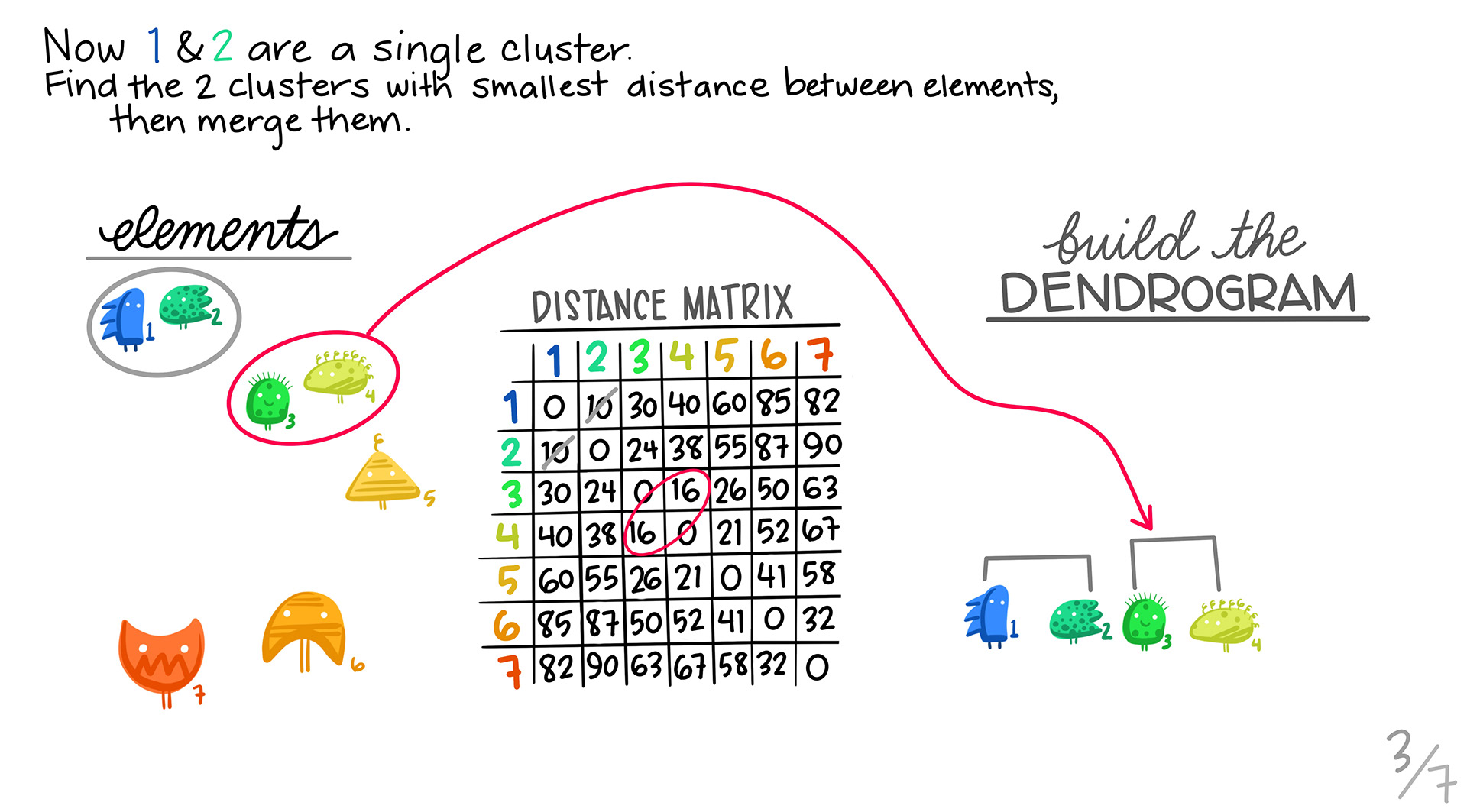
We first take the pair of profiles that are the most similar using our distance metric, and then make them into a single profile by aggregating. Those two profiles are removed, and the new profile is calculated. Note that the dimensions of our distance matrix gets smaller with each merge, until we are left with only a few values.
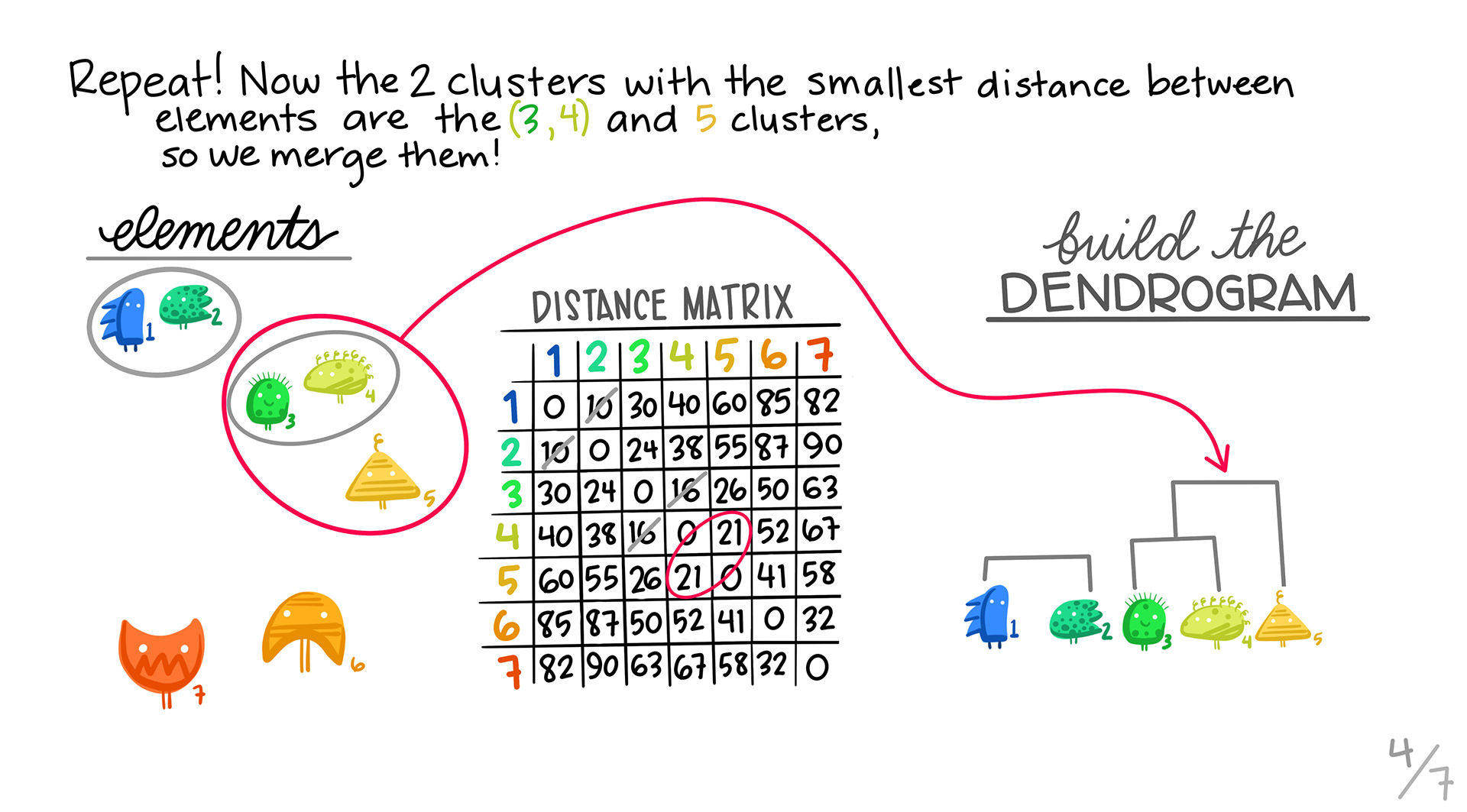
We find the next pair of genes that are most similar, and then pair them up into a cluster.
We repeat steps 2 and 3. In this case, it turns out that one of the 2 member clusters is the most similar to the the orange triangle.
5. Repeating:
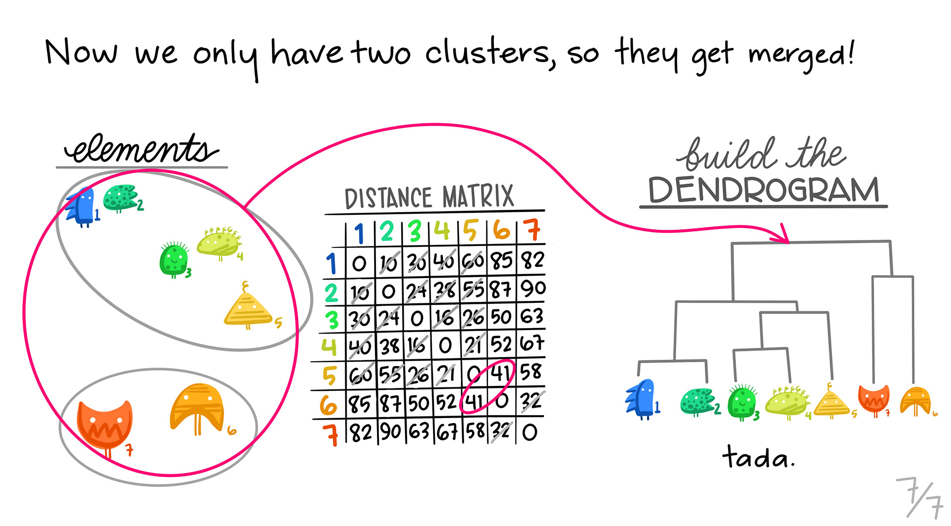
We continue, until we combine all of the clusters into one.
The one drawback to these slides is that they don’t show the distance matrix shrinking as we cluster profiles together. Every cluster gets combined into a single column/row in our distance matrix as we go down the line.
7.9 Interpreting the Tree
The trees are important to understand. They will give you a idea of how strong the clusters are in the data.
Ideally, you want a tree with some depth, and with balanced clusters. Again, having noisy data will affect this.
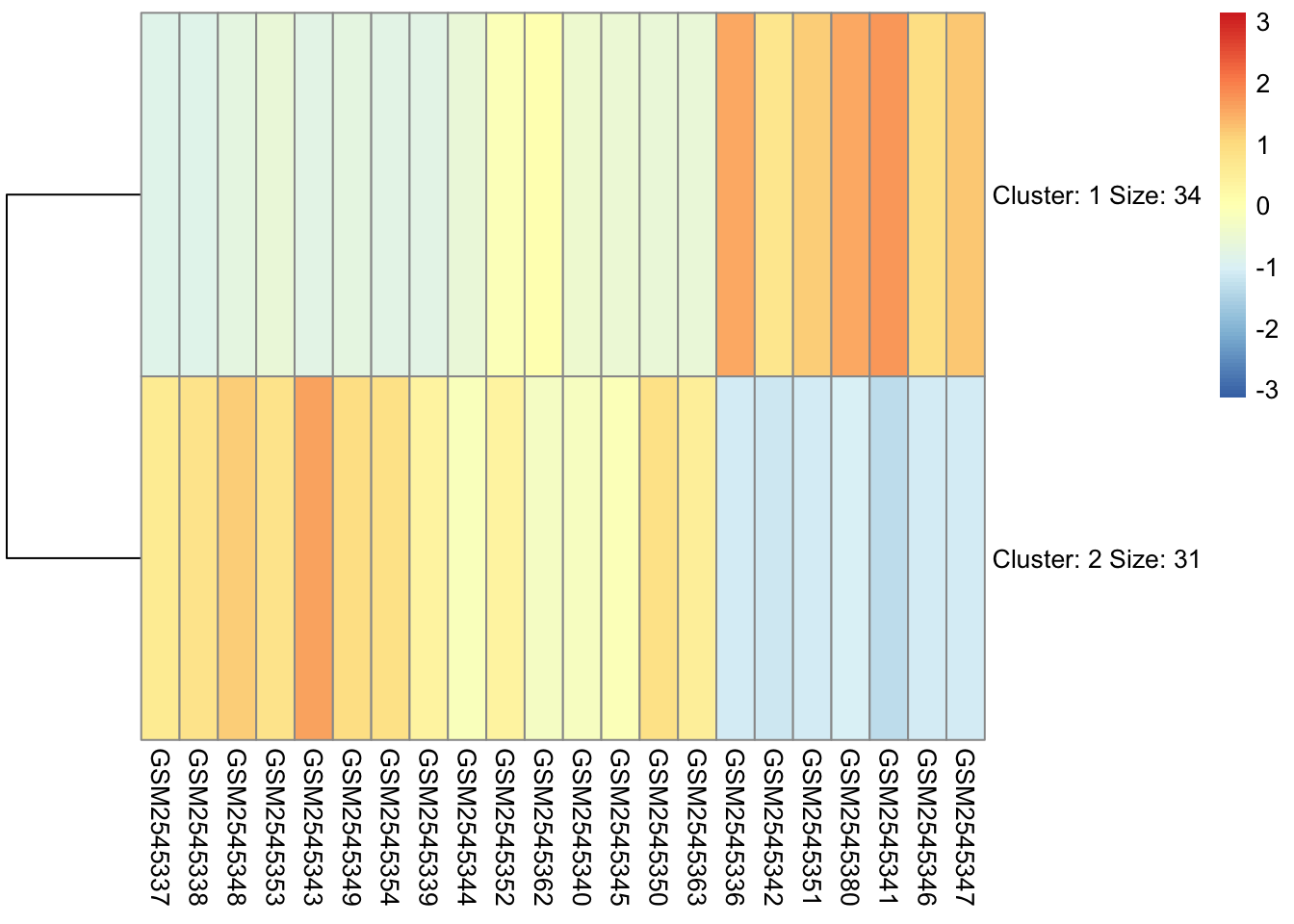
7.10 Cutting the Tree
When we use a hierarchical algorithm, we need to cut the tree into clusters. We tend to do this by cutting the tree at a specific height.
cutree() will attempt to cut a tree at a height based on the number of clusters you give it, but it’s not a guaranteed output if that number doesn’t exist at some level in the tree.
We have two choices: we can specify a desired number of clusters (k), and cutree() will attempt to cut the tree at a height that gives us this number:
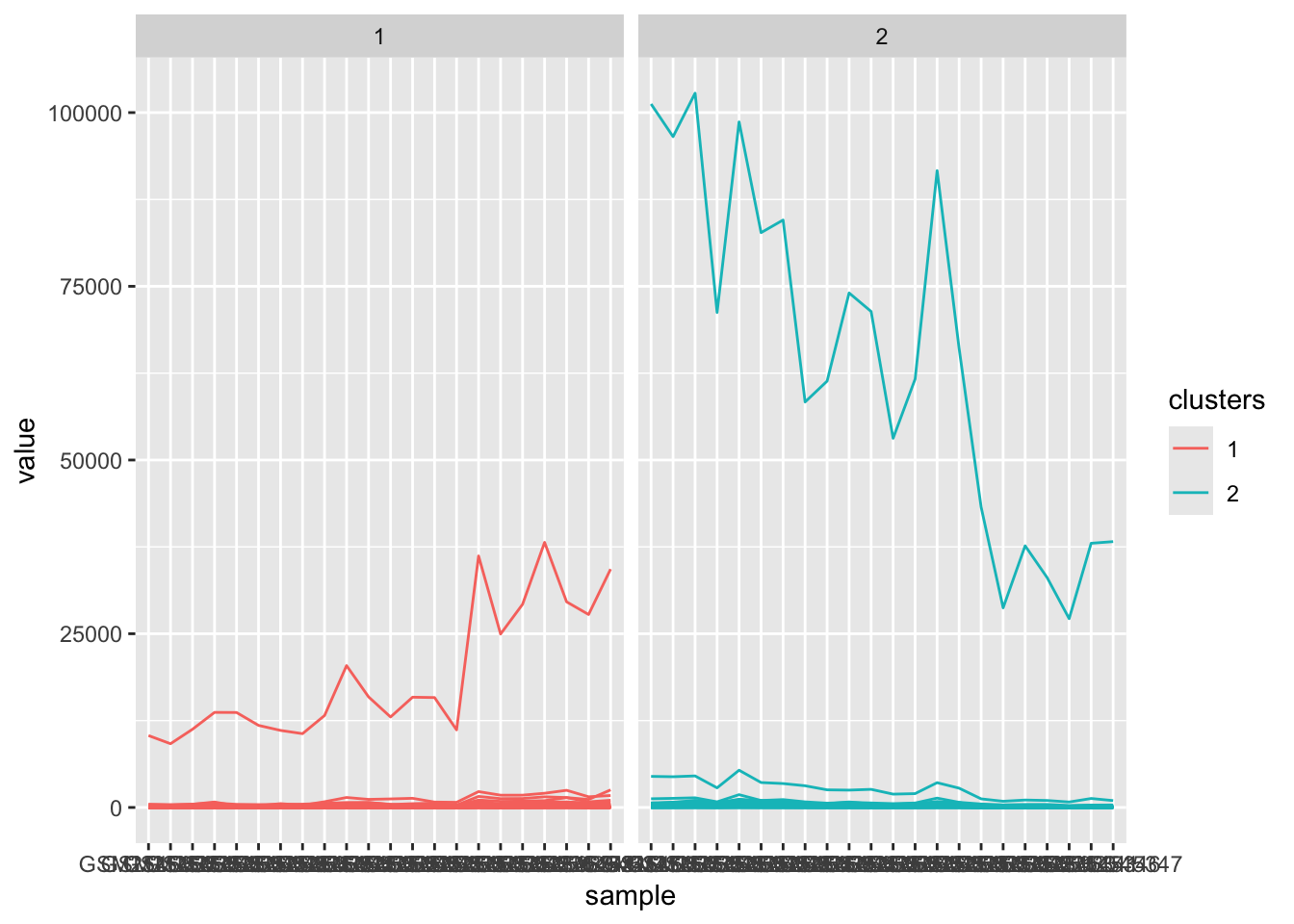
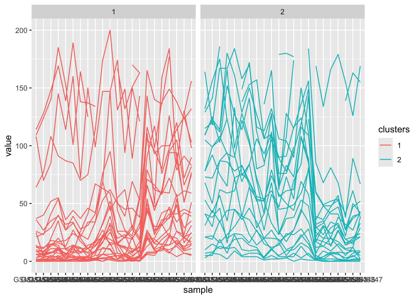
We can add these cluster assignments to our orignal gse_data in order to plot the clusters separately. I like to do this because it can actually highlight patterns in our clusters that are not obvious.
# join cluster annotations to the long data framegse_cluster_time<-gse_cluster_long|>inner_join(y=time_frame, by=c("sample"="geo_accession"))|>mutate(sample =factor(sample, levels =colnames(gse_data)))|>mutate(clusters =factor(clusters))gse_cluster_time
My approach with clustering is to try and compare the clusters from mutliple methods. I try to find consensus clusters by trying to see what genes are in common across the different methods.

 5. Repeating: