8 Loading Data/PCA
8.1 Learning Objectives
-
Load RNAseq data from csv files into a
SummarizedExperimentobject - Apply Principal Components Analysis (PCA) across samples
- Apply UMAP (Uniform Manifold Approximation and Projection) across samples
8.2 Loading in Data
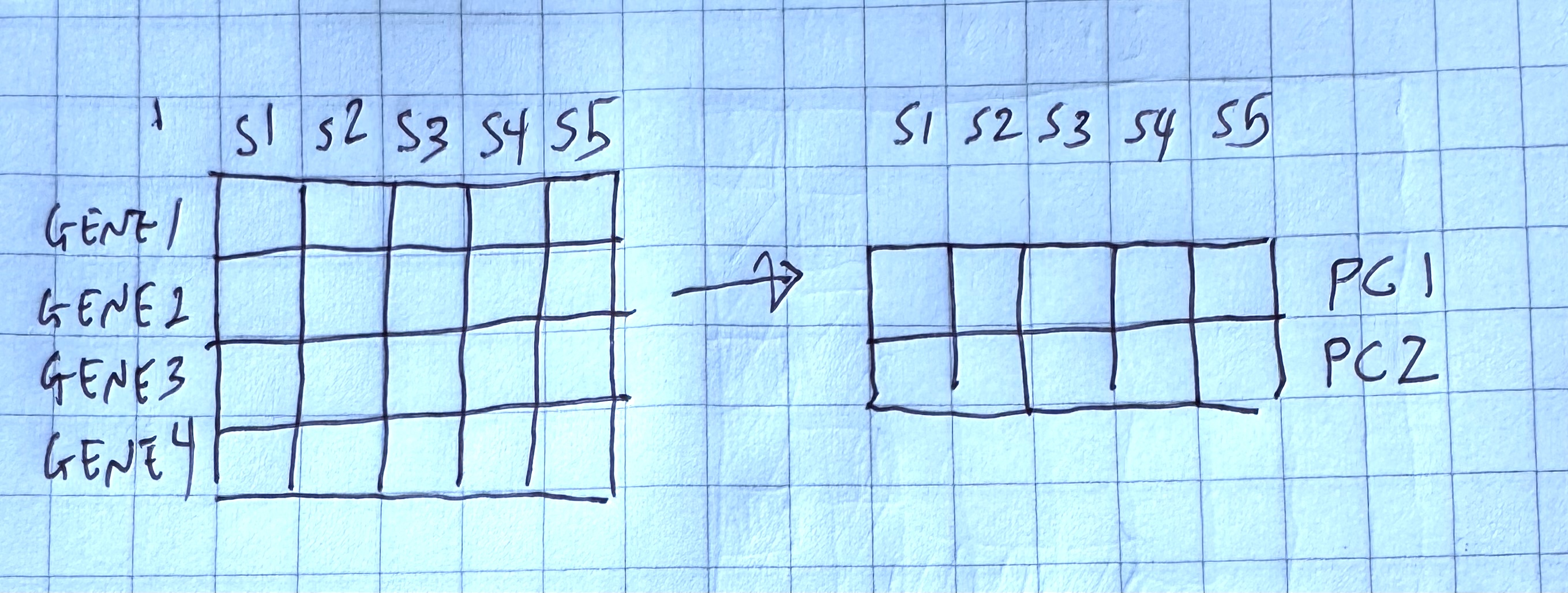
We’ve finally reached the point in which we can load data into SummarizedExperiment objects.
We are going to simplify the analysis by only using the 22 cerebellum samples. Expression quantification was done using STAR to align to the mouse genome and then counting reads that map to genes. In addition to the counts per gene per sample, we also need information on which sample belongs to which Sex/Time point/Replicate. And for the genes, it is helpful to have extra information called annotation.
Let’s read in the data files that we downloaded in the last episode and start to explore them:
8.2.1 Counts
One of the things Bioconductor requires: our counts matrix needs to have row names. The tidyverse does not like row names, so we’ll use read.csv() (instead of readr::read_csv()).
Because we need the rownames, we need to use a different process for loading in our data from CSV format. We’ll use read.csv() with the row.names argument to specify which columns are the rownames.
We could also do the following:
counts2 <- read.csv("data/GSE96870_counts_cerebellum.csv")
rownames(counts2) <- counts2[,1]
counts2 <- counts2[,-1]
head(counts2)
Genes are in rows and samples are in columns, so we have counts for 41,786 genes and 22 samples.
8.2.2 Sample annotations
Next read in the sample annotations. Because samples are in columns in the count matrix, we will name the object coldata:
Now samples are in rows with the GEO sample IDs as the rownames, and we have 10 columns of information. The columns that are the most useful for this workshop are geo_accession (GEO sample IDs again), sex and time.
8.2.3 Gene annotations
The counts only have gene symbols, which while short and somewhat recognizable to the human brain, are not always good absolute identifiers for exactly what gene was measured. For this we need additional gene annotations that were provided by the authors.
The count and coldata files were in comma separated value (.csv) format, but we cannot use that for our gene annotation file because the descriptions can contain commas that would prevent a .csv file from being read in correctly.
Instead the gene annotation file is in tab separated value (.tsv) format. Likewise, the descriptions can contain the single quote ' (e.g., 5’), which by default R assumes indicates a character entry. So we have to use a more generic function read.delim() with extra arguments to specify that we have tab-separated data (sep = "\t") with no quotes used (quote = "").
We also put in other arguments to specify that the first row contains our column names (header = TRUE), the gene symbols that should be our row.names are in the 5th column (row.names = 5), and that NCBI’s species-specific gene ID (i.e., ENTREZID) should be read in as character data even though they look like numbers (colClasses argument). You can look up this details on available arguments by simply entering the function name starting with question mark. (e.g., ?read.delim)
rowranges <- read.delim("data/GSE96870_rowranges.tsv",
                        sep = "\t",
                        colClasses = c(ENTREZID = "character"),
                        header = TRUE,
                        quote = "",
                        row.names = 5)
dim(rowranges)
[1] 41786 7For each of the 41,786 genes, we have the seqnames (e.g., chromosome number), start and end positions, strand, ENTREZID, gene product description (product) and the feature type (gbkey). These gene-level metadata are useful for the downstream analysis. For example, from the gbkey column, we can check what types of genes and how many of them are in our dataset:
table(rowranges$gbkey)
     C_region     D_segment          exon     J_segment      misc_RNA
           20            23          4008            94          1988
         mRNA         ncRNA precursor_RNA          rRNA          tRNA
        21198         12285          1187            35           413
    V_segment
          535
8.2.4 Assemble SummarizedExperiment
We will create a SummarizedExperiment from these objects:
- The
countobject will be saved inassaysslot
- The
coldataobject with sample information will be stored incolDataslot (sample metadata)
- The
rowrangesobject describing the genes will be stored inrowRangesslot (features metadata)
Before we put them together, you ABSOLUTELY MUST MAKE SURE THE SAMPLES AND GENES ARE IN THE SAME ORDER! Even though we saw that count and coldata had the same number of samples and count and rowranges had the same number of genes, we never explicitly checked to see if they were in the same order. One quick way to check:
[1] TRUE[1] TRUE# If the first is not TRUE, you can match up the samples/columns in
# counts with the samples/rows in coldata like this (which is fine
# to run even if the first was TRUE):
tempindex <- match(colnames(counts), rownames(coldata))
coldata <- coldata[tempindex, ]
# Check again:
all.equal(colnames(counts), rownames(coldata)) [1] TRUEOnce we have verified that samples and genes are in the same order, we can then create our SummarizedExperiment object. Then we can also create our DESeqDataSet object as well:
# One final check:
stopifnot(rownames(rowranges) == rownames(counts), # features
          rownames(coldata) == colnames(counts)) # samples

se <- SummarizedExperiment(
    assays = list(counts = as.matrix(counts)),
    rowRanges = as(rowranges, "GRanges"),
    colData = coldata
)

dds <- DESeq2::DESeqDataSet(se, design = ~ sex + time)
Warning in DESeq2::DESeqDataSet(se, design = ~sex + time): some variables in
design formula are characters, converting to factorsNow we can move forward as usual.
8.3 PCA and Dimensionality Reduction Methods
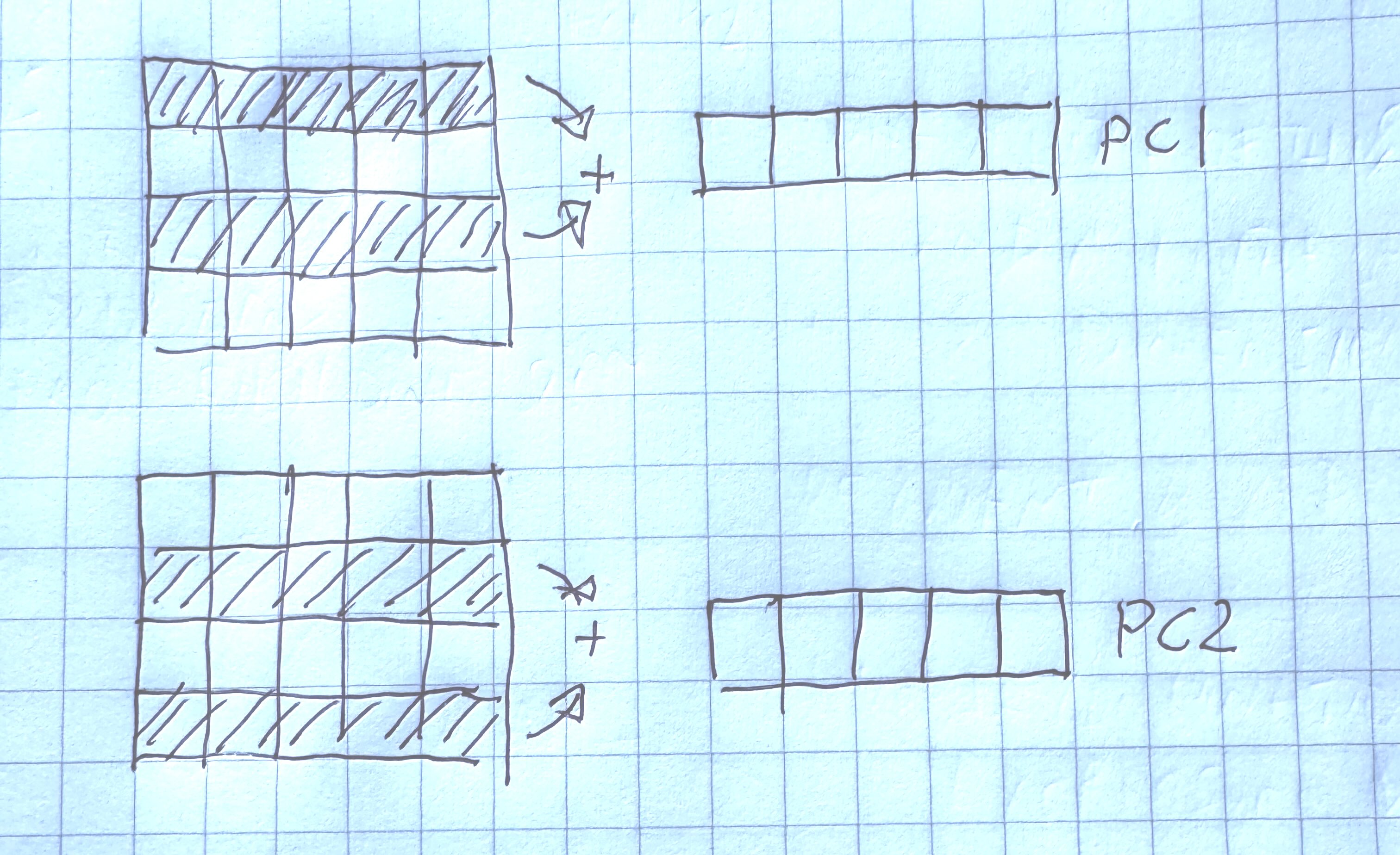
Principal component analysis (PCA) is a dimensionality reduction method, which projects the samples into a lower-dimensional space.
This lower-dimensional representation can be used for visualization, or as the input for other analysis methods.
It is an unsupervised method in the sense that no external information about the samples (e.g., the treatment condition) is taken into account.
8.3.1 What We’re Doing
We are trying to capture variability in our data, such that the two axes “squish” multiple dimensions in our data into two dimensions that we can plot.
In our case, we are trying to compress our genes into two “metagenes”, which are our new axes, that we can plot on a 2 dimensional grid.
One way to think about it is that we are a whale and we are trying to eat as many krill as possible.

How do we reorient ourselves so that we are eating the most krill?

We try to capture the most variability in the two dimensions that we’re plotting:
8.3.2 How We Do it
In order to calculate our metagenes (or principal components), we try to find linear combinations of the gene expression values such that they capture the most variability in the data.
Each principle component is orthogonal to the other. Orthogonal is a generalization of perpindicular to multiple dimensions.
plotPCA expects normalized data. Here we’re going to use vst() (variant stabilizing transformations), which does something similar to estimateSizeFactors():
using ntop=500 top features by variancepcaDataQuestion: what is the dimension of pcaData? What do the number of rows correspond to?
pcaData |>
  select(PC1, PC2, sex) |>
  ggplot() +
  aes(x=PC1, y=PC2, color = sex) +
  geom_point()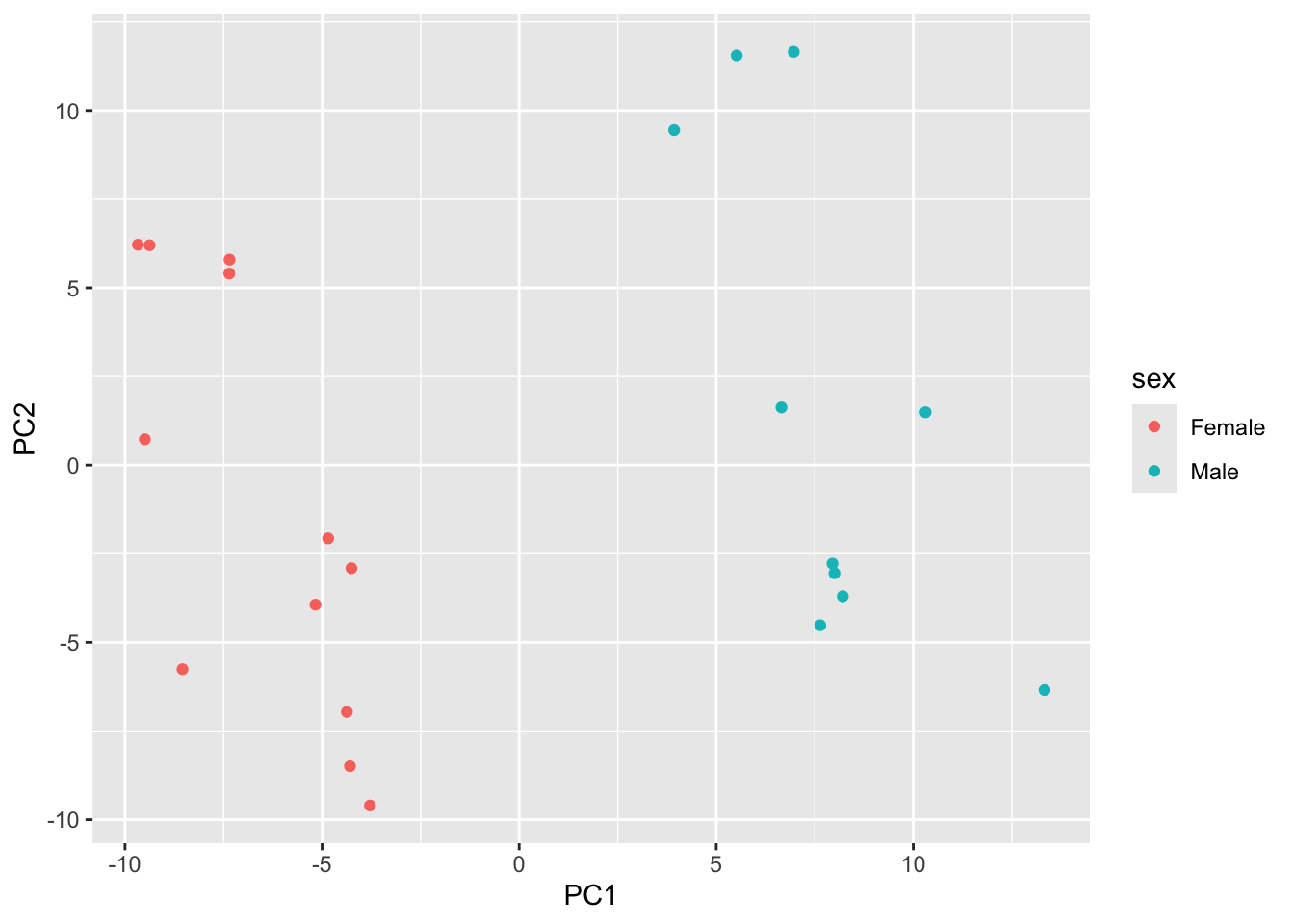
Try mapping color to time. Do you notice any trends?
pcaData |>
  select(PC1, PC2, time) |>
  ggplot() +
  aes(x=PC1, y=PC2, color = -----) +
  geom_point()
8.3.3 Understanding the Variability Captured
One of the outputs of PCA is the percent variability captured by each axes, or principal components. We can get this as an attribute of the pcaData data.frame.
We can find out the attributes that are attached to our data.frame by using attributes()
attributes(pcaData)$names
[1] "PC1" "PC2" "group" "sex" "time" "name"
$class
[1] "data.frame"
$row.names
[1] "GSM2545336" "GSM2545337" "GSM2545338" "GSM2545339" "GSM2545340"
[6] "GSM2545341" "GSM2545342" "GSM2545343" "GSM2545344" "GSM2545345"
[11] "GSM2545346" "GSM2545347" "GSM2545348" "GSM2545349" "GSM2545350"
[16] "GSM2545351" "GSM2545352" "GSM2545353" "GSM2545354" "GSM2545362"
[21] "GSM2545363" "GSM2545380"
$percentVar
[1] 0.3724206 0.2593619attr(pcaData, "percentVar") * 100[1] 37.24206 25.93619We see that the first component captures about 37% of the total variation in the data, and our second captures about 25%.
This is more important when we may be using more than 2 principal components as an input to other methods.
Here’s a PCA plot that shows both sex and time.
percentVar <- round(100 * attr(pcaData, "percentVar"))

ggplot(pcaData, aes(x = PC1, y = PC2)) +
    geom_point(aes(color = sex, shape = time), size = 5) +
    theme_minimal() +
    xlab(paste0("PC1: ", percentVar[1], "% variance")) +
    ylab(paste0("PC2: ", percentVar[2], "% variance")) +
    coord_fixed() +
    scale_color_manual(values = c(Male = "blue", Female = "red"))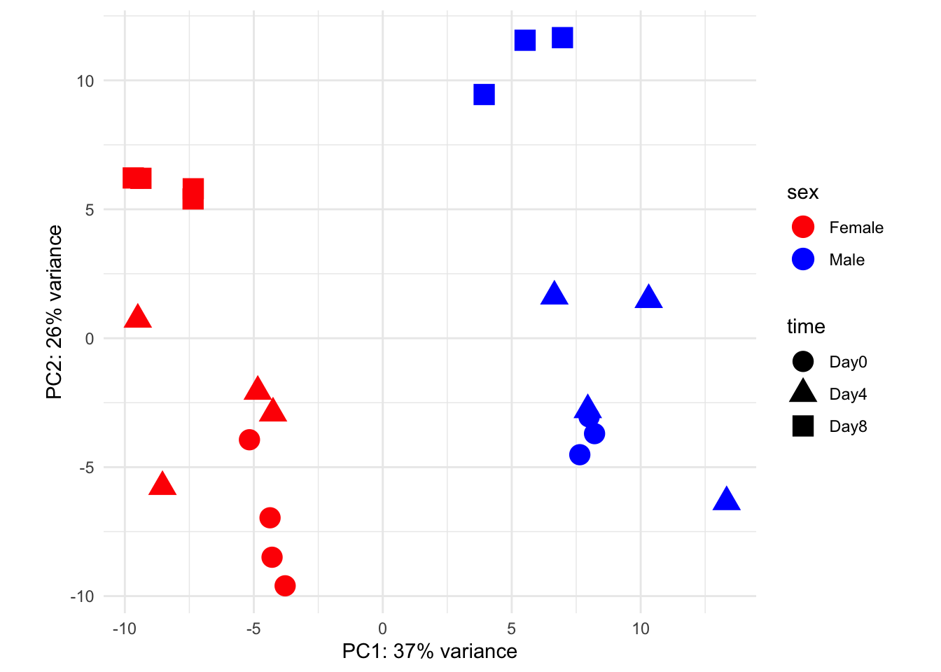
8.3.4 Doing PCA more explicitly
We can try out PCA using the prcomp() function. To do the equivalent analysis, we need to transpose gse_data:
Then we can use the broom package to extract important information, including the percent variability, which are called eigenvalues:
When we plot principal component number by percent variability, we can see that there are more than 2 principal componenets. This is called the eigenvalue plot and it helps us assess how successful our PCA was.
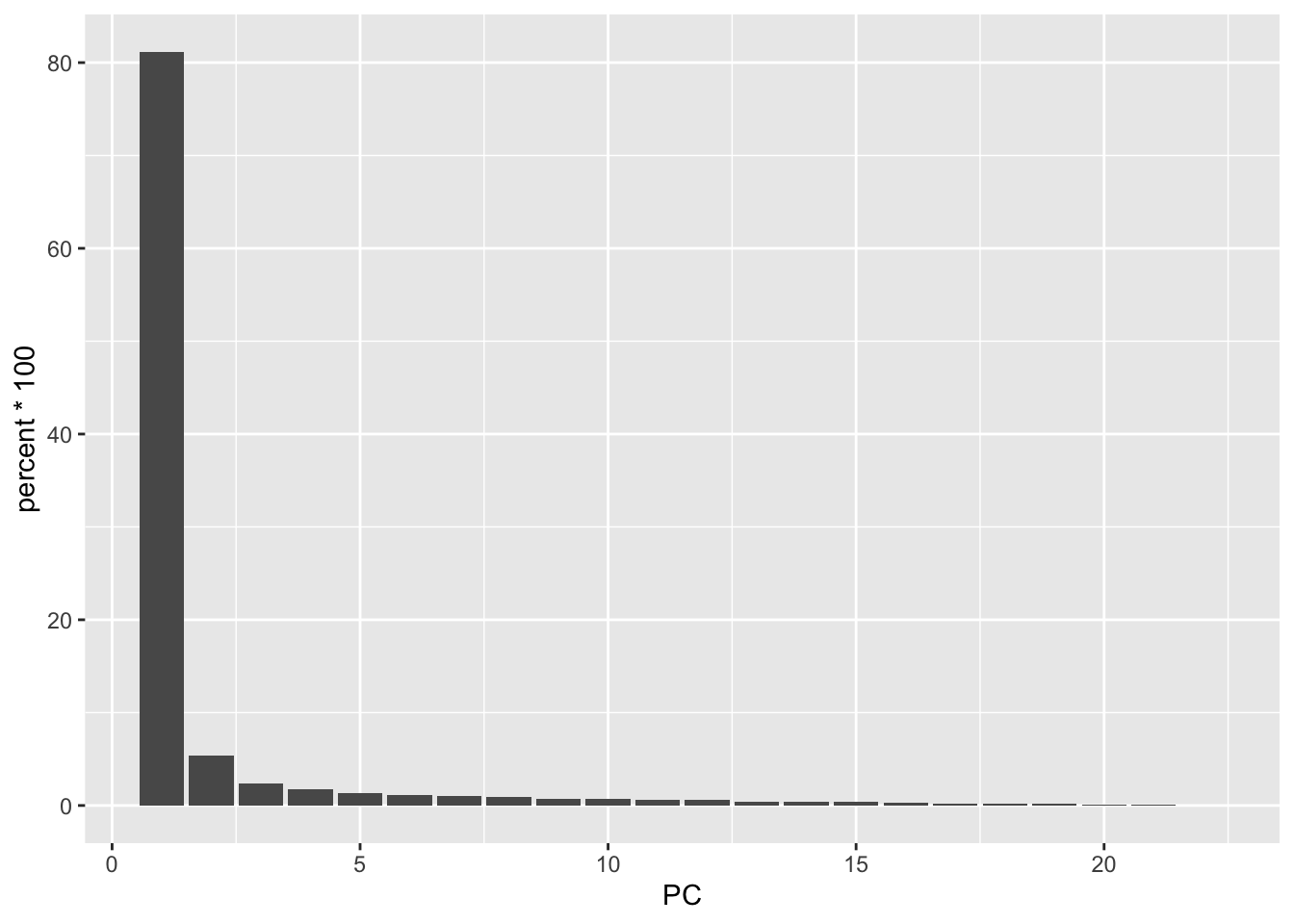
What we’re looking for is to see where the bar plot levels off, which is around PC5. The majority of the variability is captured in these components.
We can plot the PCA-transformed data by extracting the socre matrix:
score <- out |>
  tidy(matrix="scores") |>
   pivot_wider(names_from = "PC", names_prefix = "PC", values_from = "value")

score
Now, to replicate the above analysis, we need to join it back with the colData, so we can color our points by sex and/or time:
gse_fit <- readRDS("data/GSE96870_fit.rds")

cdata <- colData(gse_fit) |>
  as.data.frame()

score |>
  as.data.frame() |>
  inner_join(y=coldata,
             by=c("row"="geo_accession")) |>
  select(PC1, PC2, sex, time) |>
  ggplot() +
  aes(x=PC1, y=PC2, color=sex) |>
  geom_point()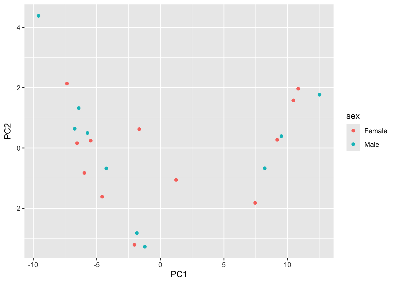
8.3.5 Try it Out
Try mapping color to time. How are the samples grouping?
score |>
  as.data.frame() |>
  inner_join(y=coldata,
             by=c("row"="geo_accession")) |>
  select(PC1, PC2, sex, time) |>
  ggplot() +
  aes(x=PC1, y=PC2, color=sex) |>
  geom_point()
In the plot above we represent the samples in a two-dimensional principal component space.
By definition, the first principal component will always represent more of the variance than the subsequent ones.
The fraction of explained variance is a measure of how much of the ‘signal’ in the data that is retained when we project the samples from the original, high-dimensional space to the low-dimensional space for visualization.
8.3.6 Loadings
The linear combinations, which are available in the rotation slot of our prcomp object out are also very interesting
tidied_pca <- tidy(out, "rotation")

tidied_pca
tidied_pca %>%
filter(PC %in% c(1:4)) %>%
mutate(PC = paste0("PC", PC)) %>%
mutate(PC = fct_inorder(PC)) %>%
ggplot(aes(value, column, fill = column)) +
geom_col(show.legend = FALSE) +
facet_wrap(~PC, nrow = 1) +
labs(y = NULL)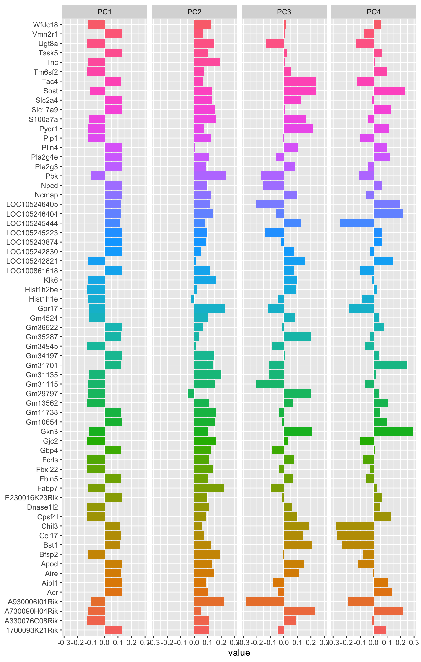
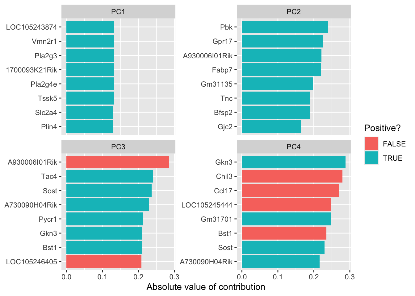
library(tidytext)

tidied_pca |>
  filter(PC %in% c(1:4)) %>%
  mutate(PC = paste0("PC", PC)) %>%
  group_by(PC) %>%
  top_n(8, abs(value)) %>%
  ungroup() %>%
  mutate(terms = reorder_within(column, abs(value), PC)) %>%
  ggplot(aes(abs(value), terms, fill = value > 0)) +
  geom_col() +
  facet_wrap(~PC, scales = "free_y") +
  scale_y_reordered() +
  labs(
    x = "Absolute value of contribution",
    y = NULL, fill = "Positive?"
  )
8.3.7 Resources
8.3.8 What about UMAP?
- UMAP is a method that uses non-linear combinations of our genes to produce metagenes.
- If you’re interested in learning more, there is a great page here: https://umap-learn.readthedocs.io/en/latest/